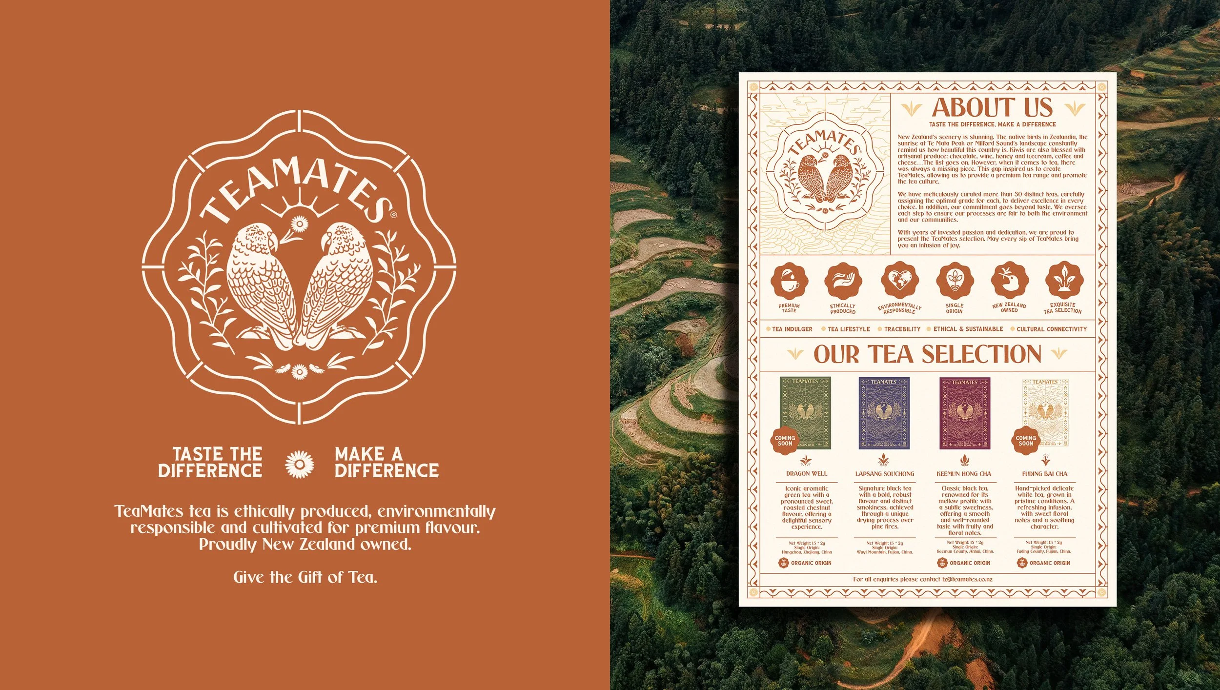
TEAMATES BRAND IDENTITY
TeaMates
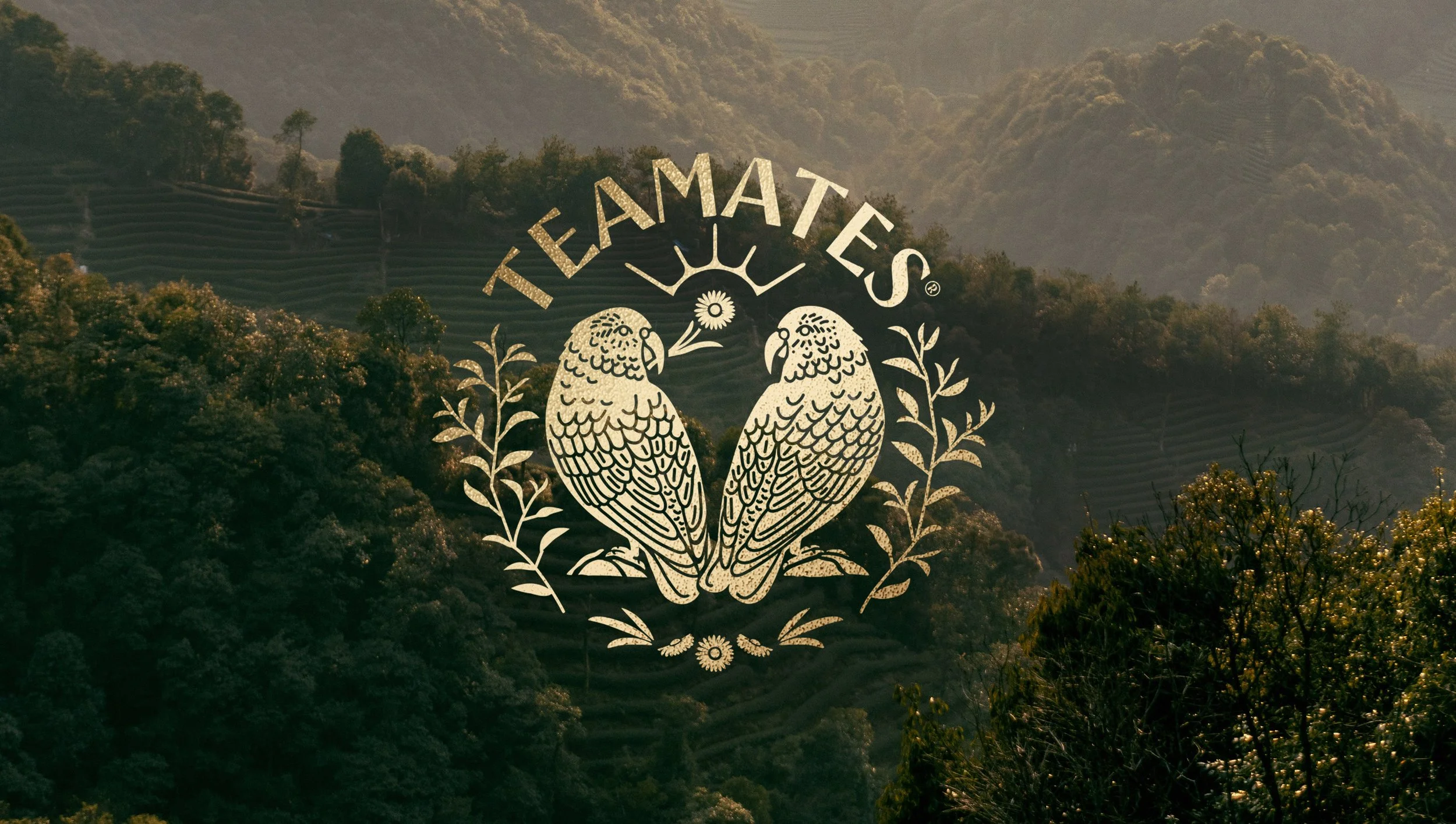
TeaMates bring premium tea from China’s finest tea fields to New Zealand.
Despite being a tea-drinking nation, the founders of TeaMates saw a gap in the market for traditional Chinese tea, available to New Zealanders outside of Asian grocery stores. They created TeaMates to bring a tea heritage steeped in history, meticulous growing, crafting and flavour to a wider audience, in packaging that reflects both cultures and the act of gift giving.
OVERVIEW
DESIGN SCOPE
All branding and design by Ima Creative
Art Direction
Brand Strategy
Brand Identity Design
Illustration
Packaging Design
Merchandise Design
Signage & Menus
-
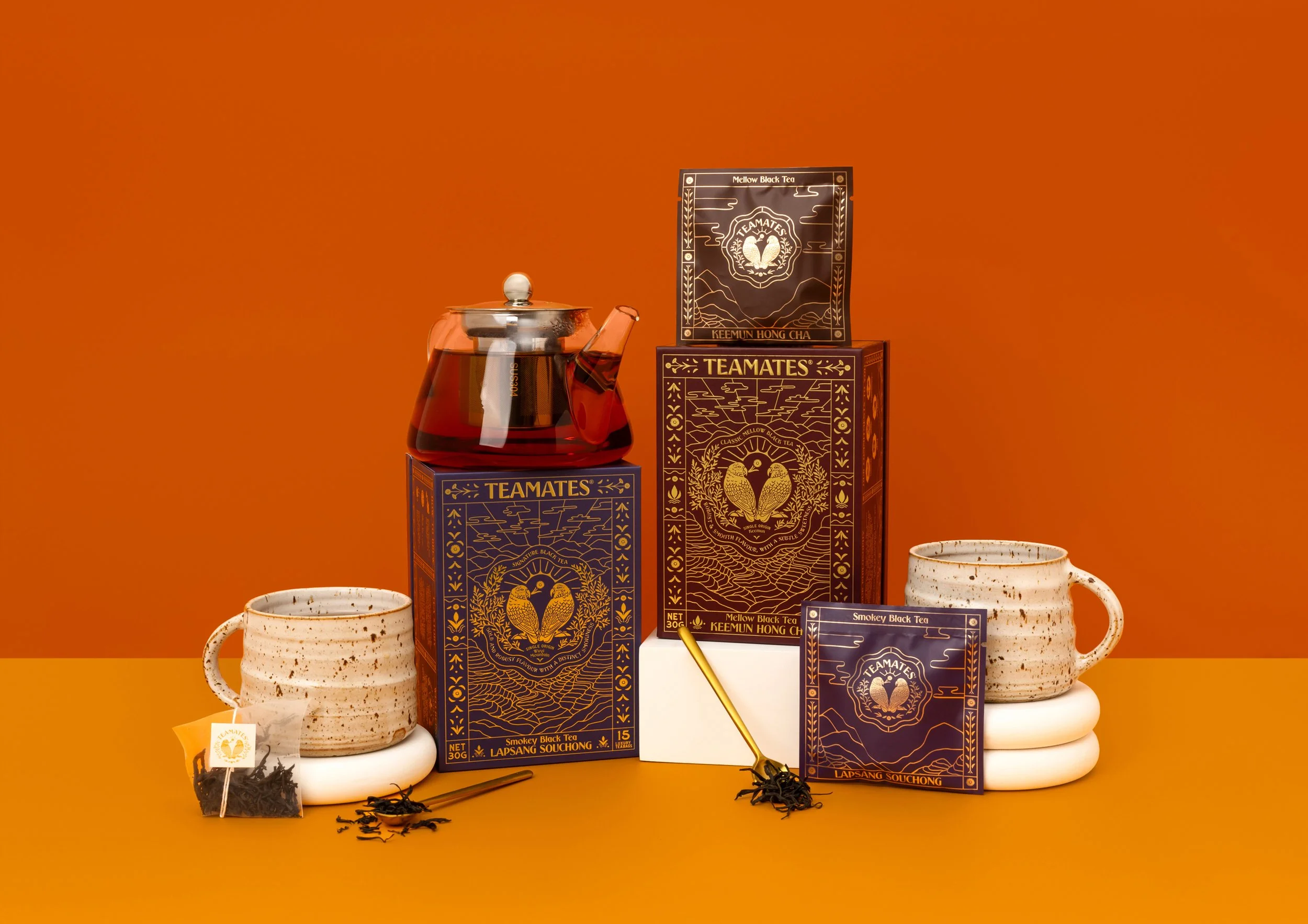
TeaMates collaborated with Ima Creative to create a full brand identity and packaging design for the launch of their premium Chinese teas into the New Zealand market.
TeaMates’ founder had observed a strong tea culture in New Zealand and an open embrace of Japanese tea and matcha; but noted a gap in the market for premium grade Chinese tea that has been a staple of Chinese culture for centuries, offering full flavour beverages with many health benefits. A majority of these teas were only found in Asian grocery stores, the packaging lacking the comprehensive language translation for english speaking customers.
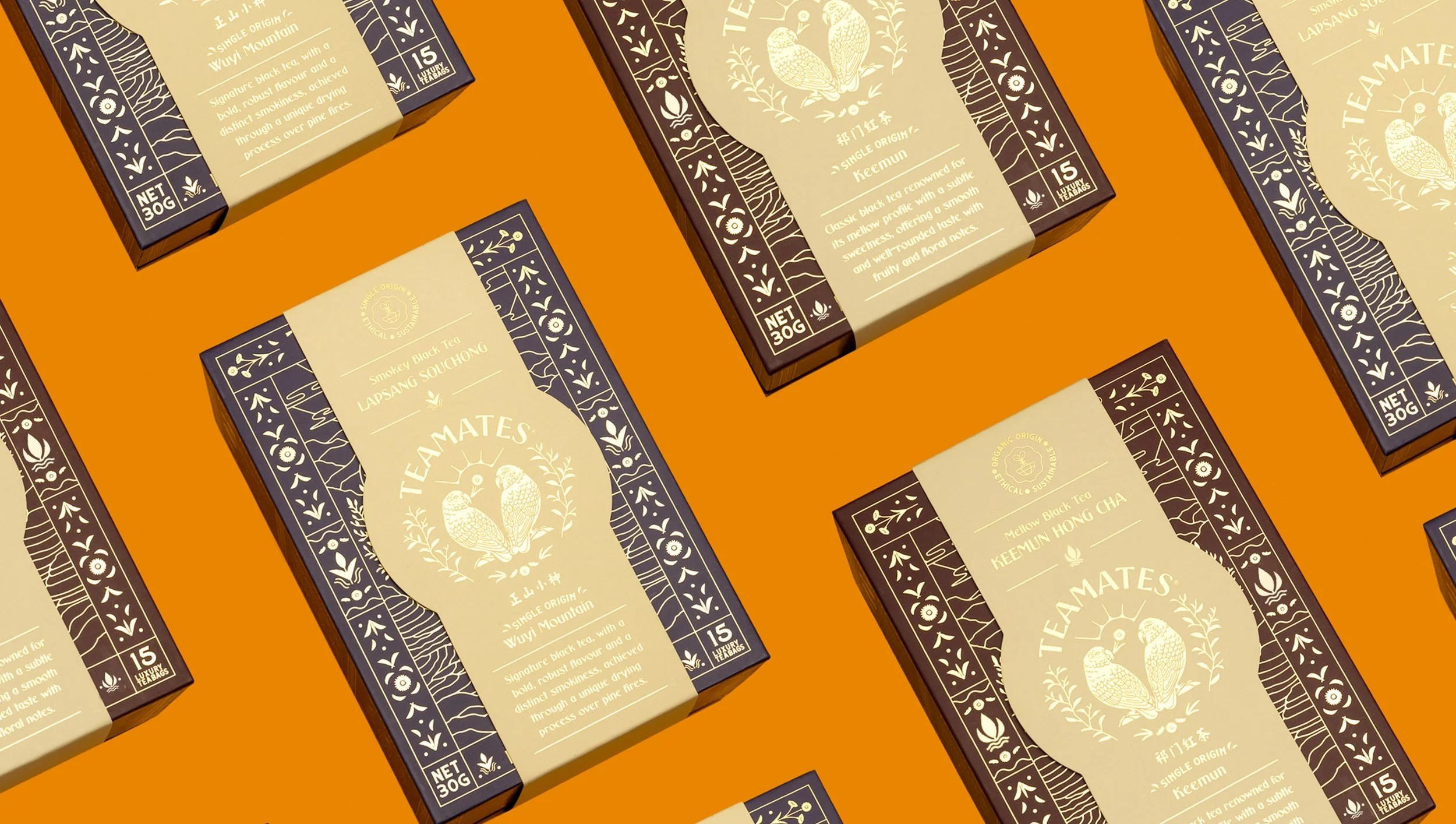
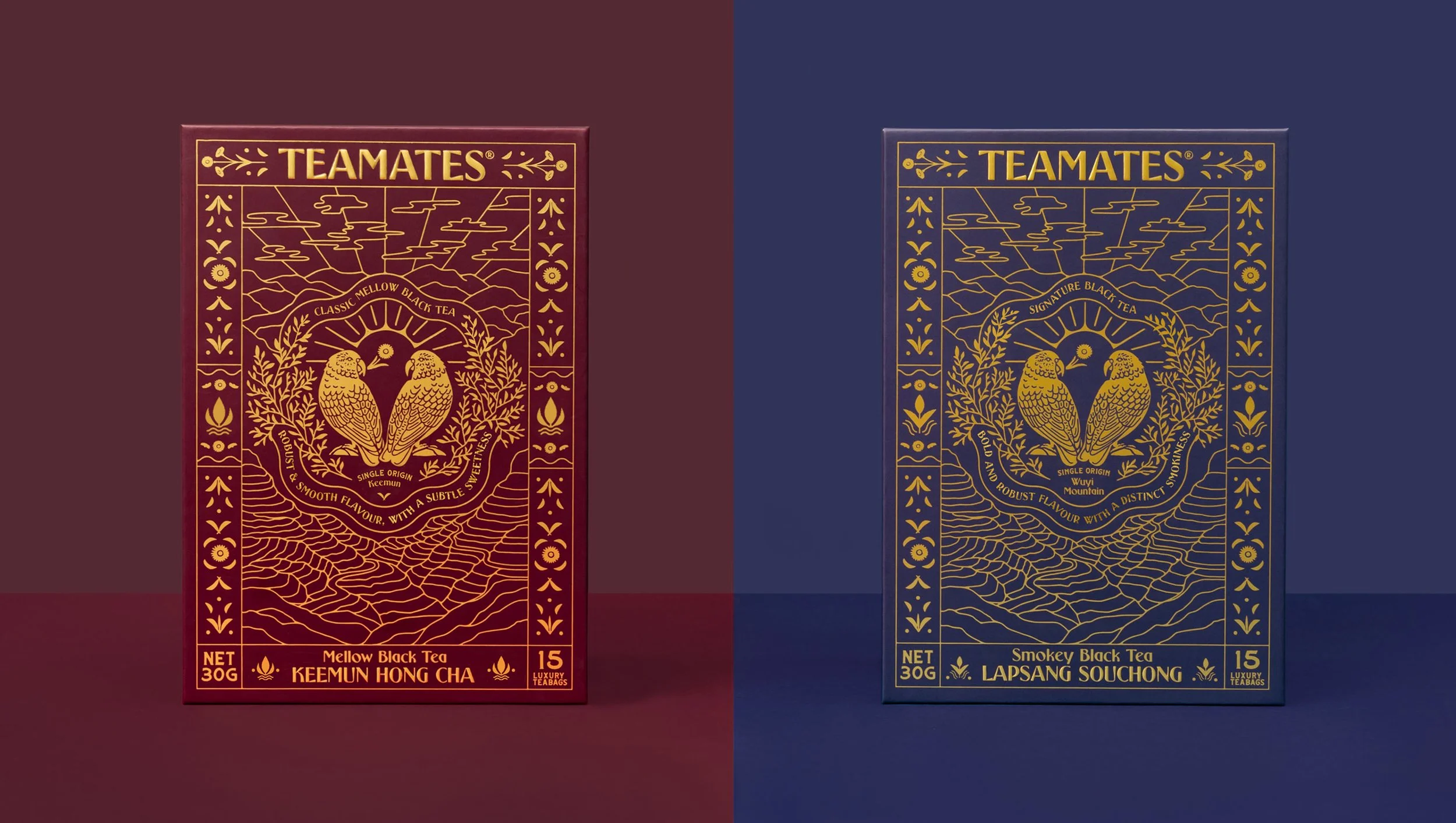
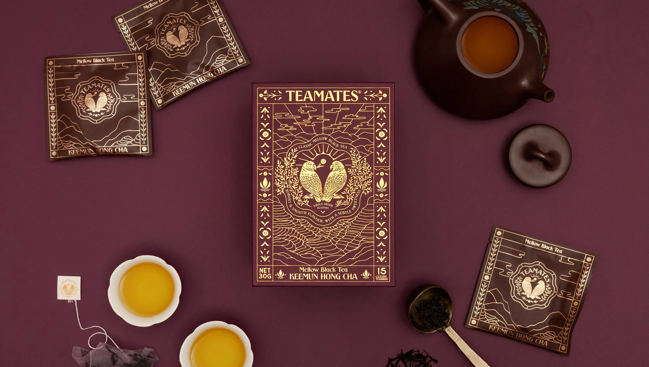
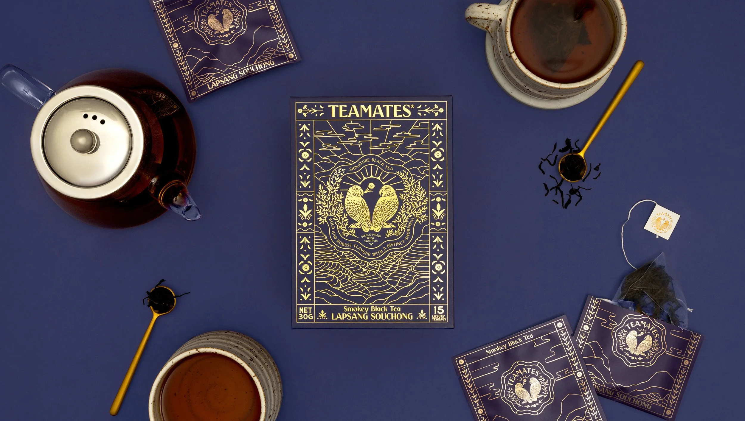
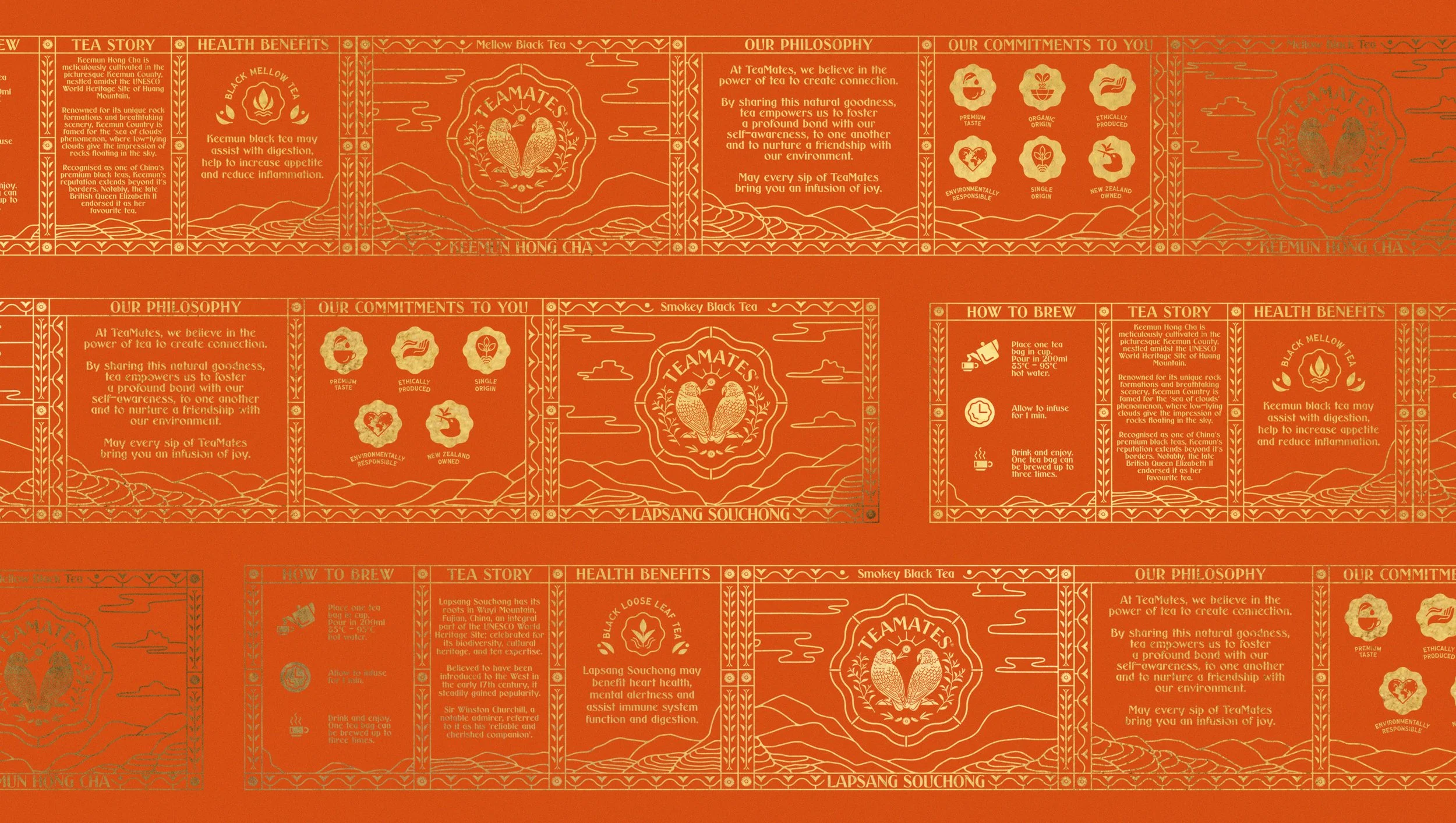
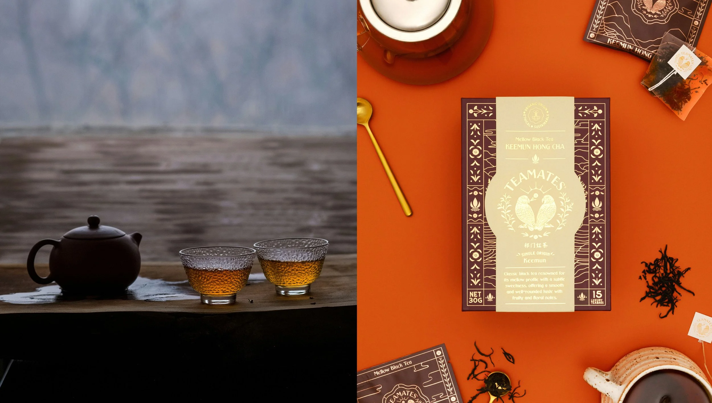
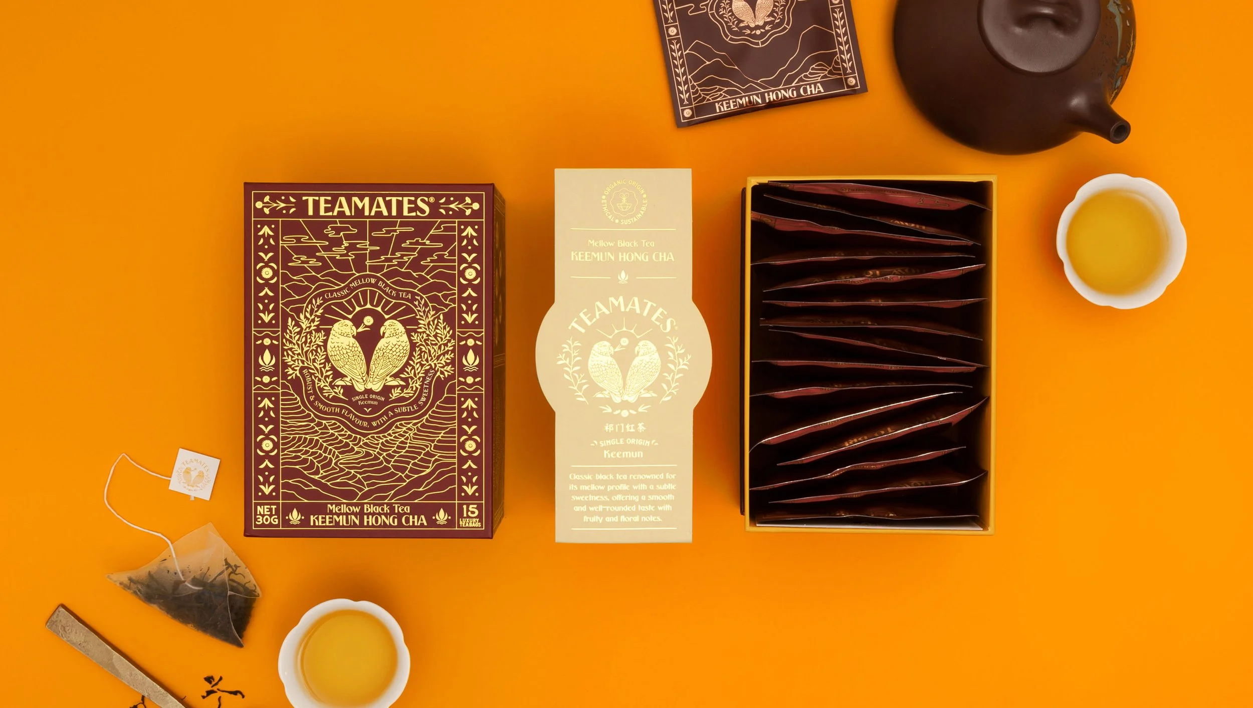
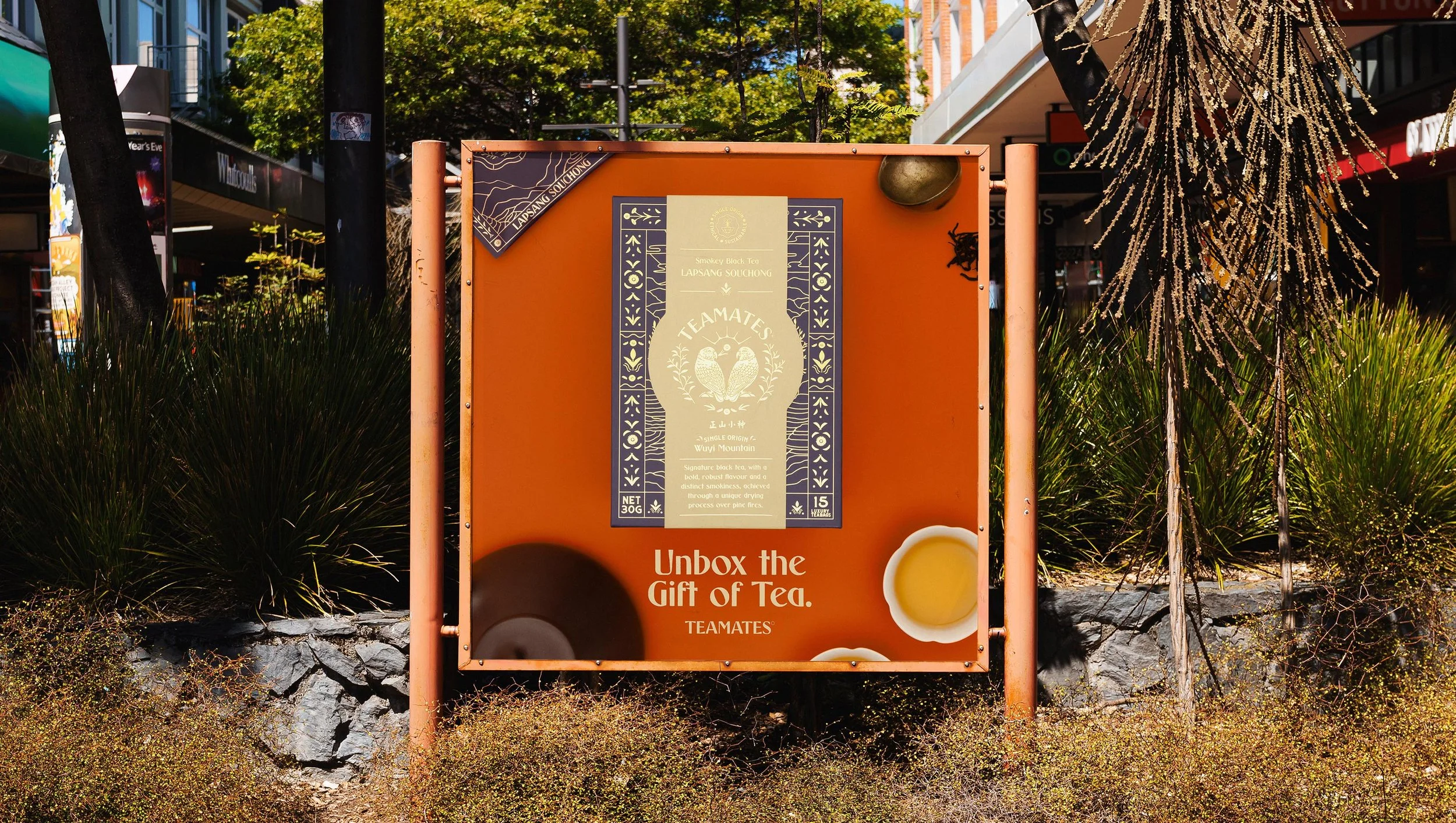
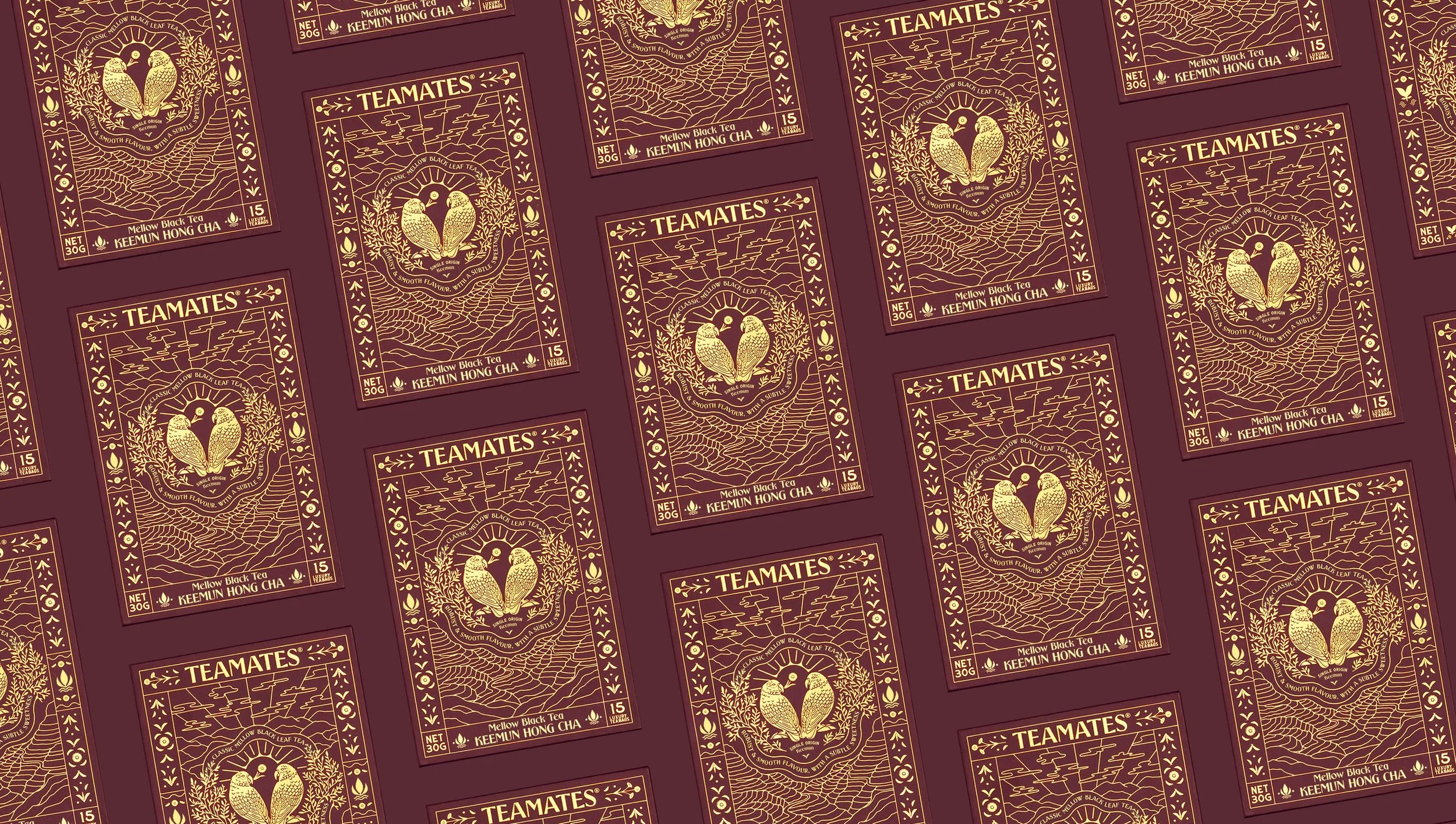
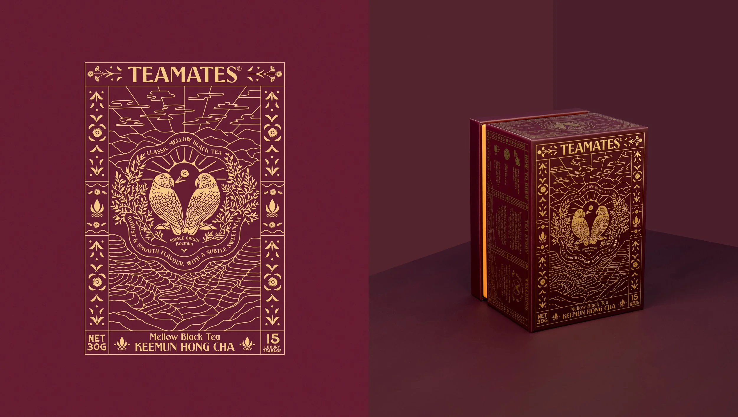
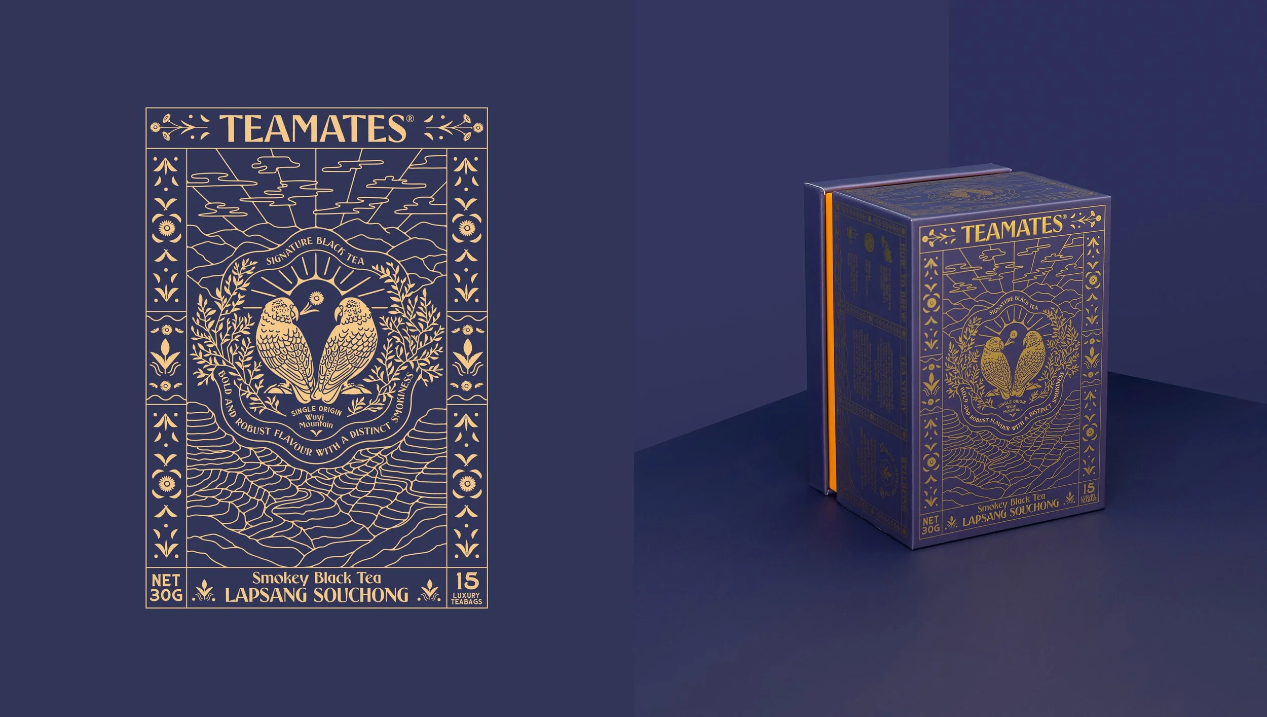
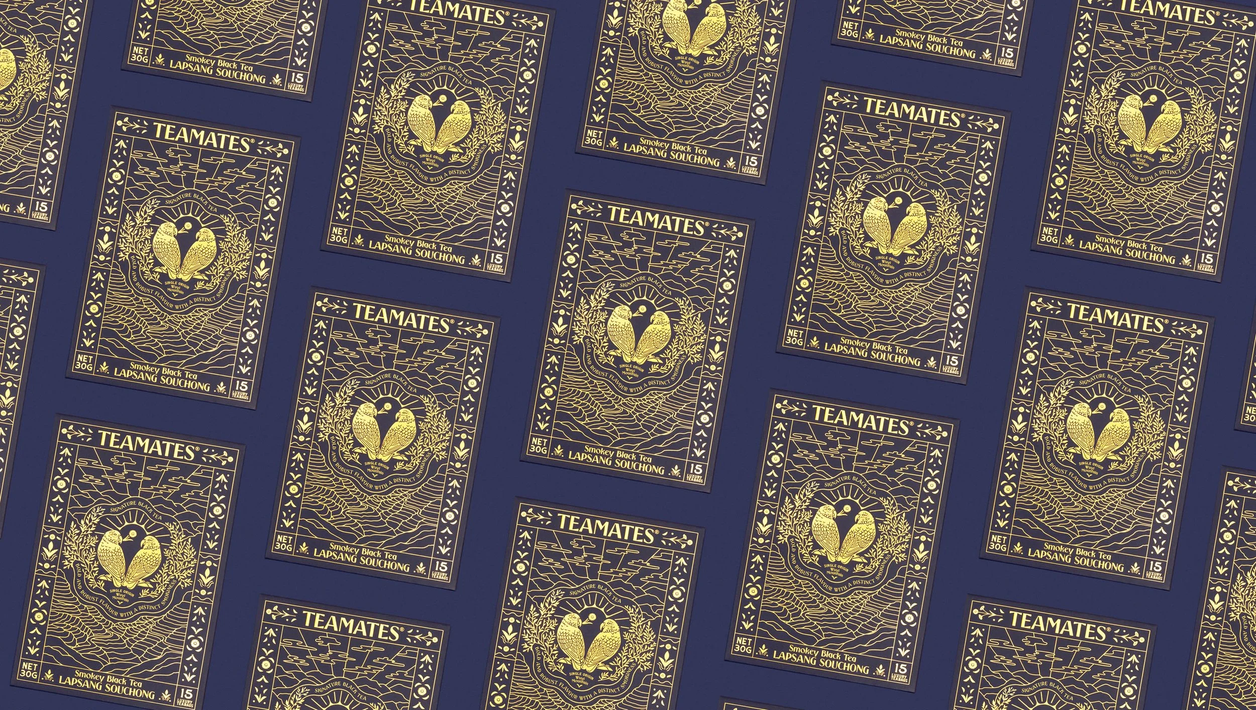
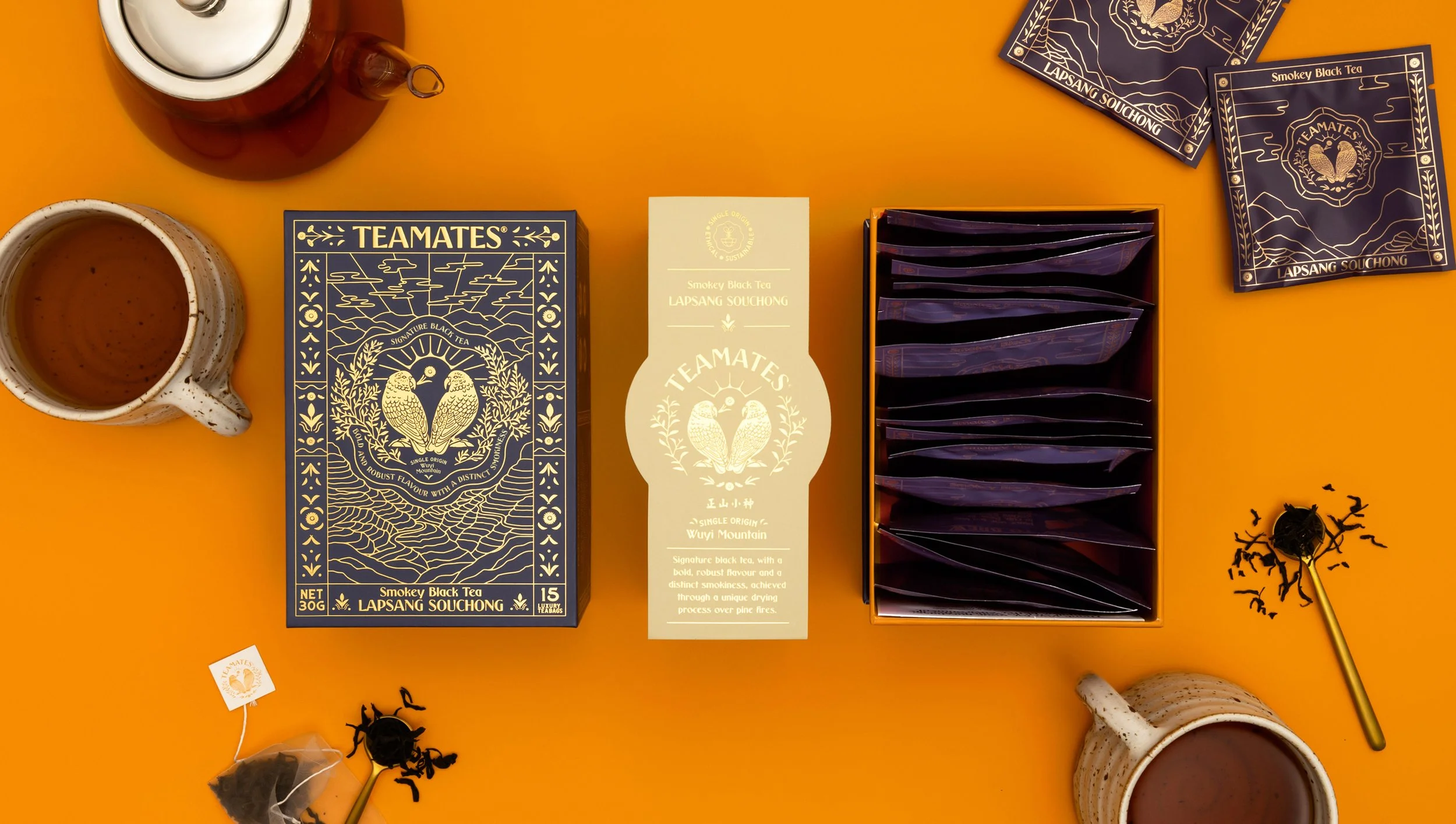
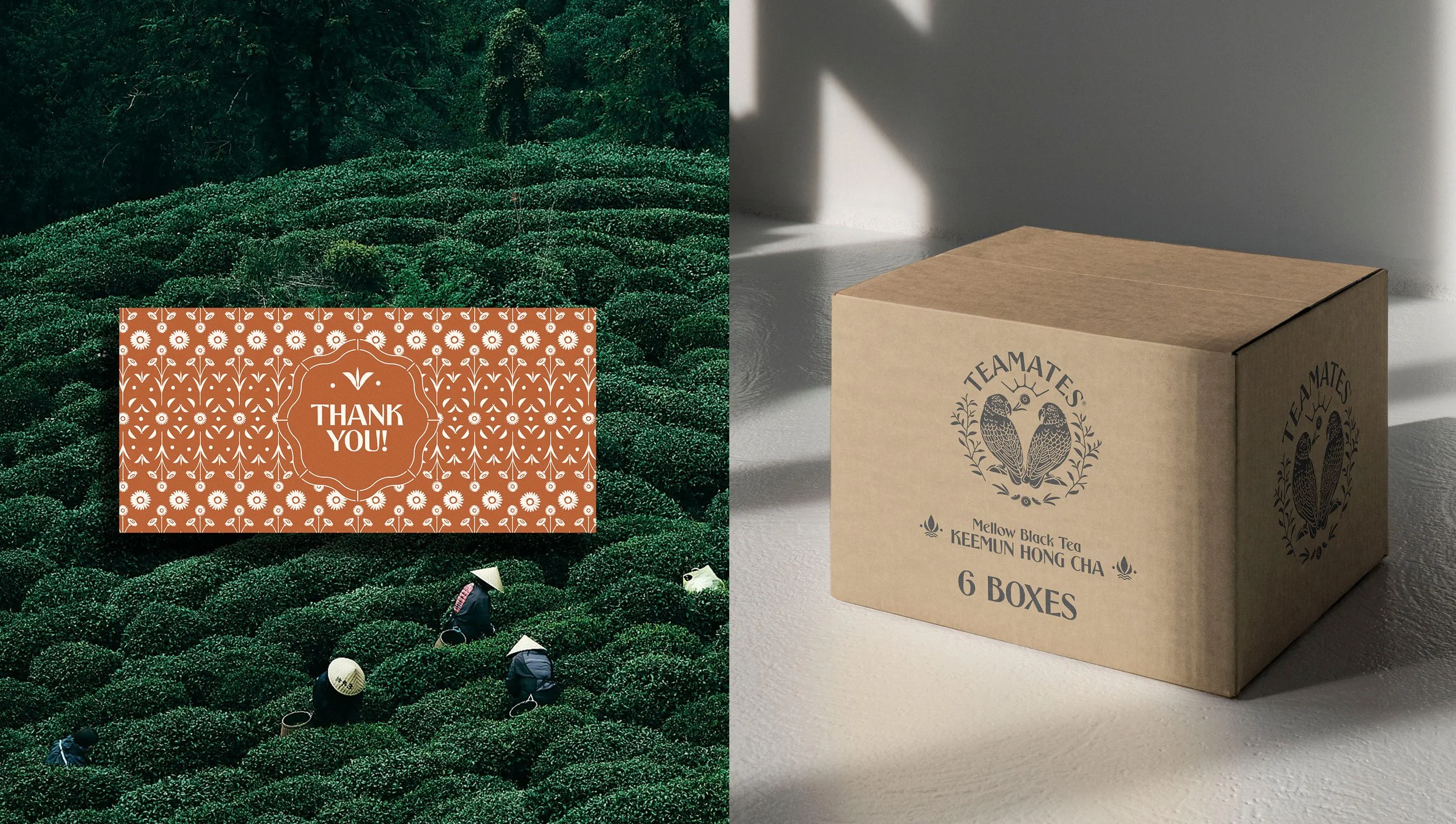
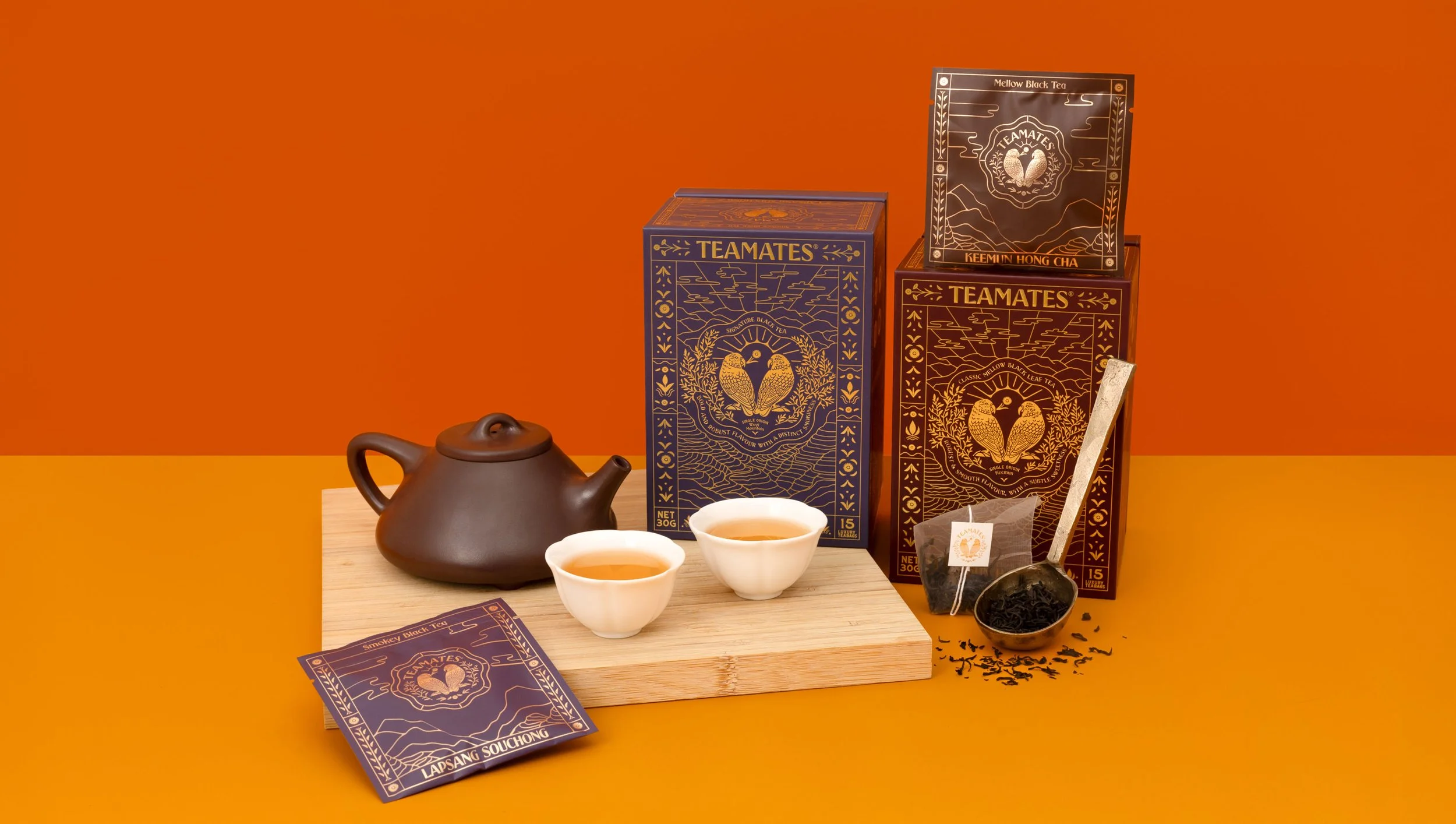
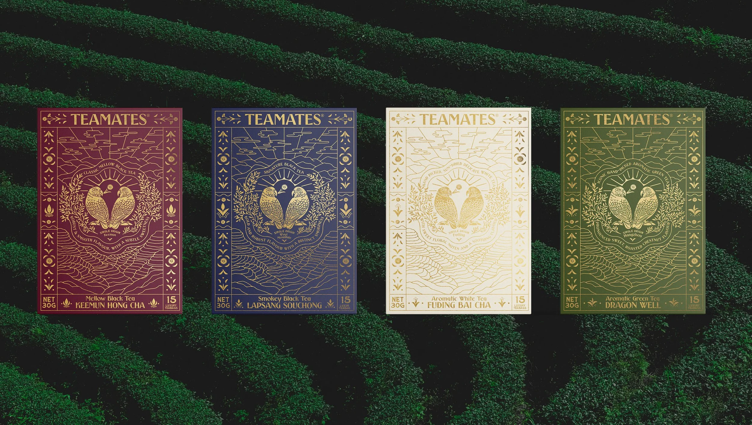
From this observation, he created TeaMates, engaging the creative services of Ima Creative to design a packaging system that referenced antique Chinese tea tins with a modern update for a more western palette. Ima Creative conducted research into Chinese tea culture, where premium tea is gifted to one another; sharing a cup of tea combines a ritual of careful brewing and drinking. This idea was visually translated into the packaging design; the box is presented with an outer sleeve akin to a decorative ribbon, the removal of the sleeve reveals a gold foil printed box, with an intricate illustrated design incorporating all the essential information of the tea and visuals of the tea fields from which the tea derives. When the lid of the box is removed, a display of gold foil envelopes are uncovered, each containing a compostable tea bag of the tea. These sit against a bright orange interior, a metaphor for the change of colour (and flavour) tea provides once brewed.The box has been designed with shelf appeal in mind; the illustrated design and premium quality of the print and box material creates an item of beauty, rather than a throwaway container. The box provides a pleasing visual on a kitchen bench or open shelf as an item on display.
The logo design reflects this idea of gifting; the two native Kea parrots used in the central logo, one gifting the other a native Mountain Daisy. This behaviour was observed by TeaMate’s founder on an alpine hike in the South Island of New Zealand and inspired his idea for the business.
-
Photograph credits to LS Creative Studio