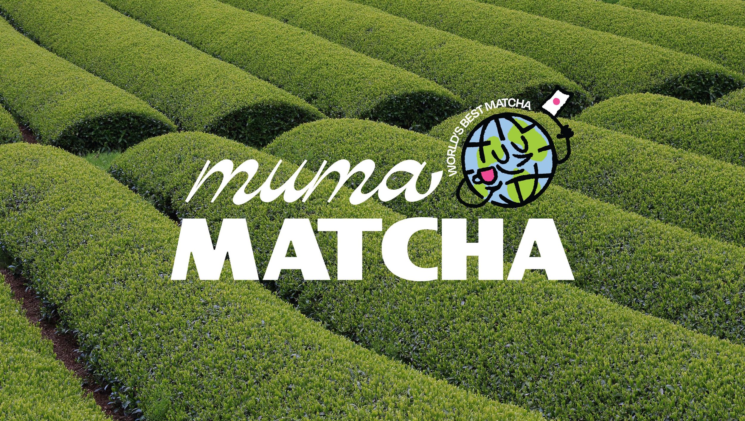
MUMA MATCHA REBRAND
Muma Matcha
Muma Matcha provides plant powered energy and focus.
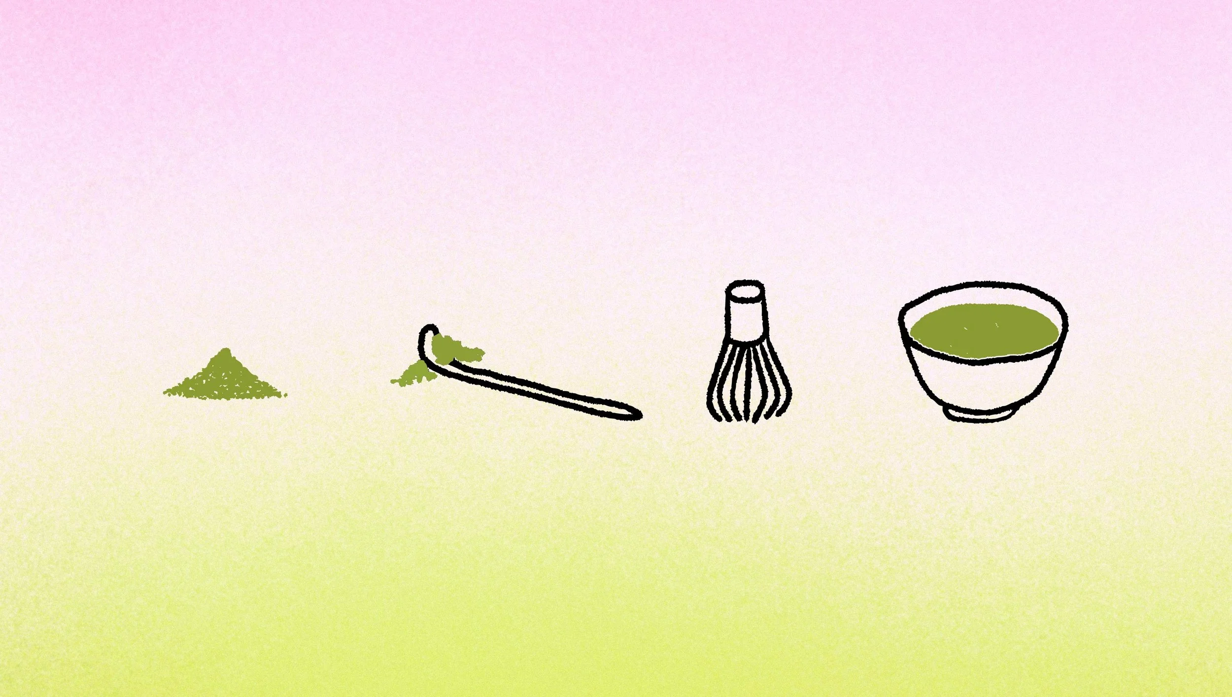
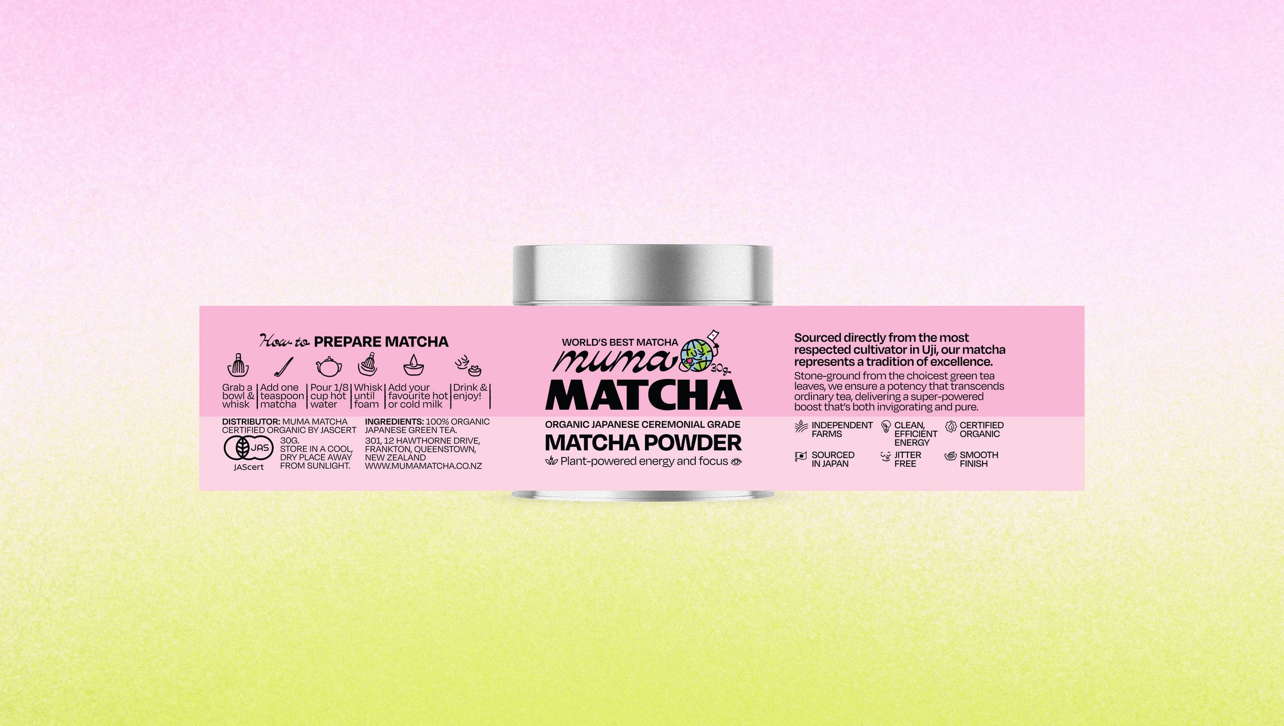
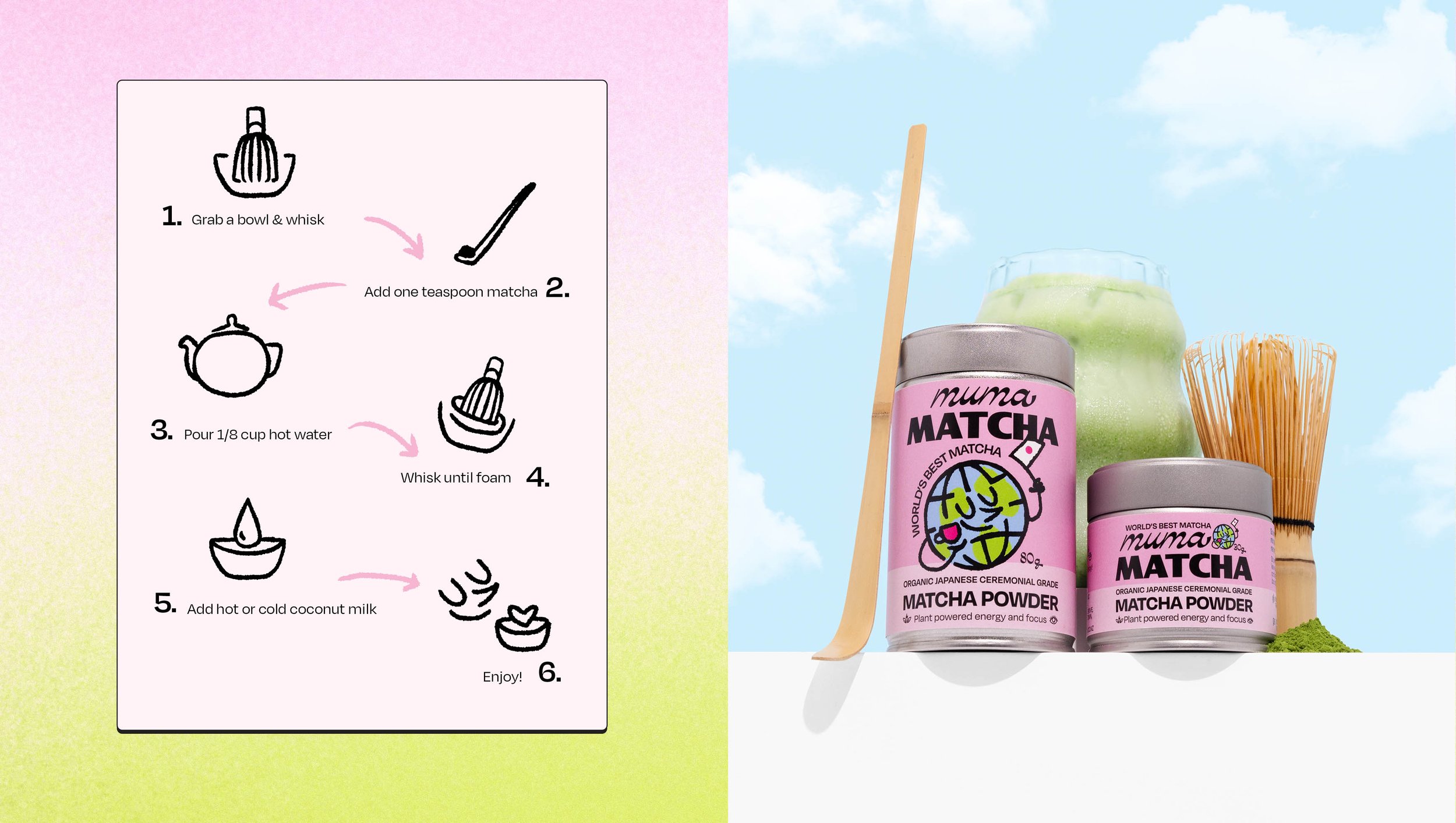
Sourced from the tea fields of Uji, Japan, Muma Matcha delivers a ceremonial grade matcha right to your door. Made from stone ground green tea leaves, matcha is the answer for hours of calm, clear-headed energy. Pure, organic and unmatched.
OVERVIEW
DESIGN SCOPE
All branding and design by Ima Creative
Art Direction
Brand Strategy
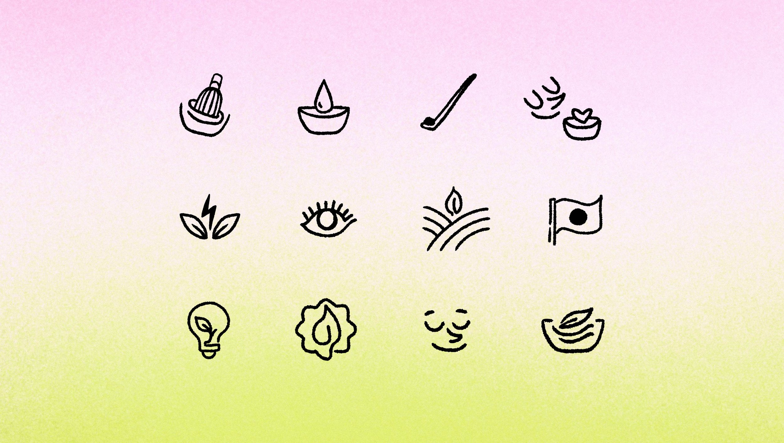
Brand identity
Illustration
Packaging Design
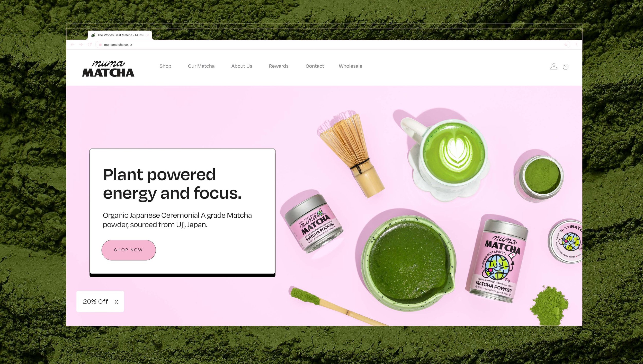
Web Design
-
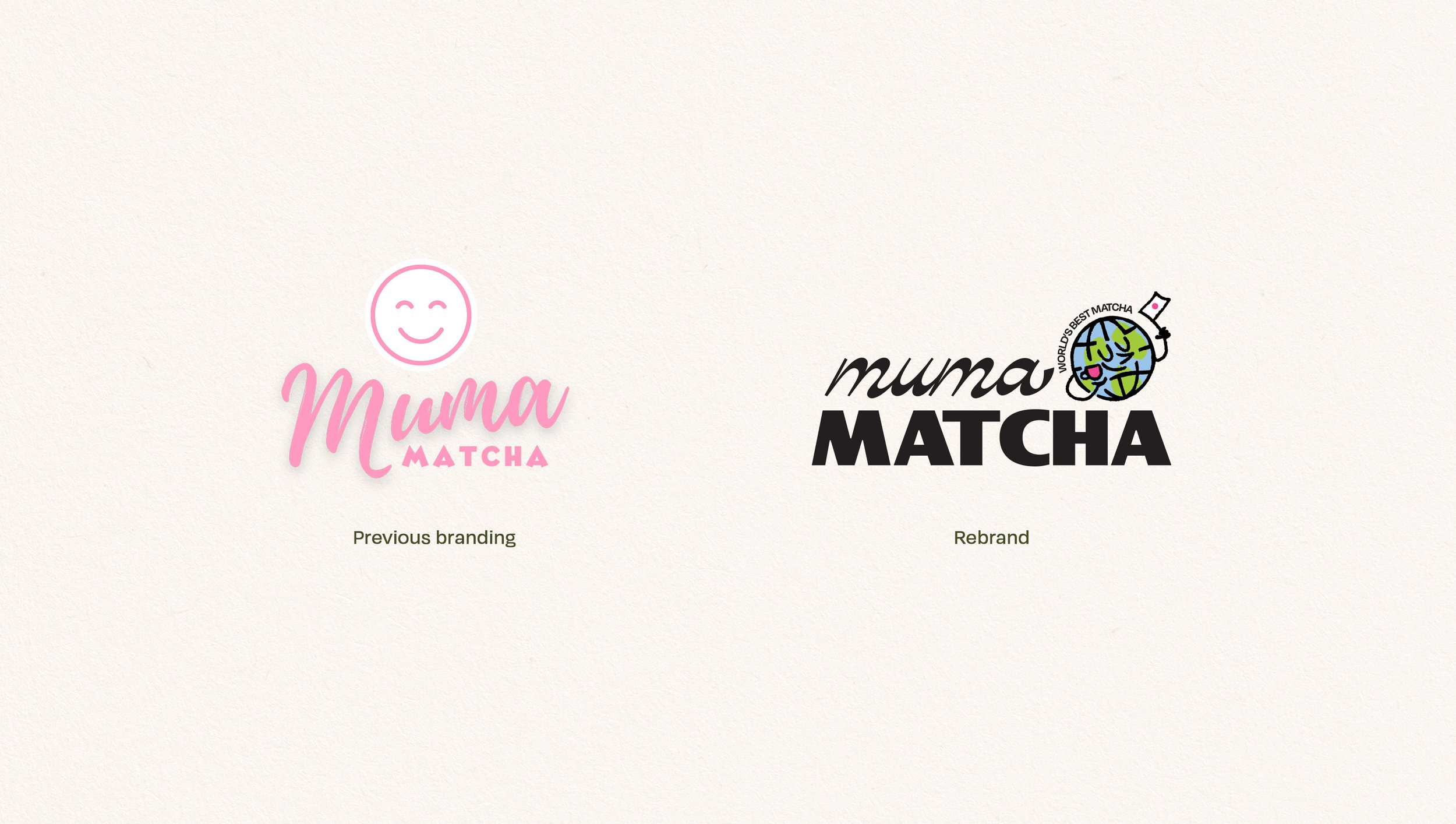
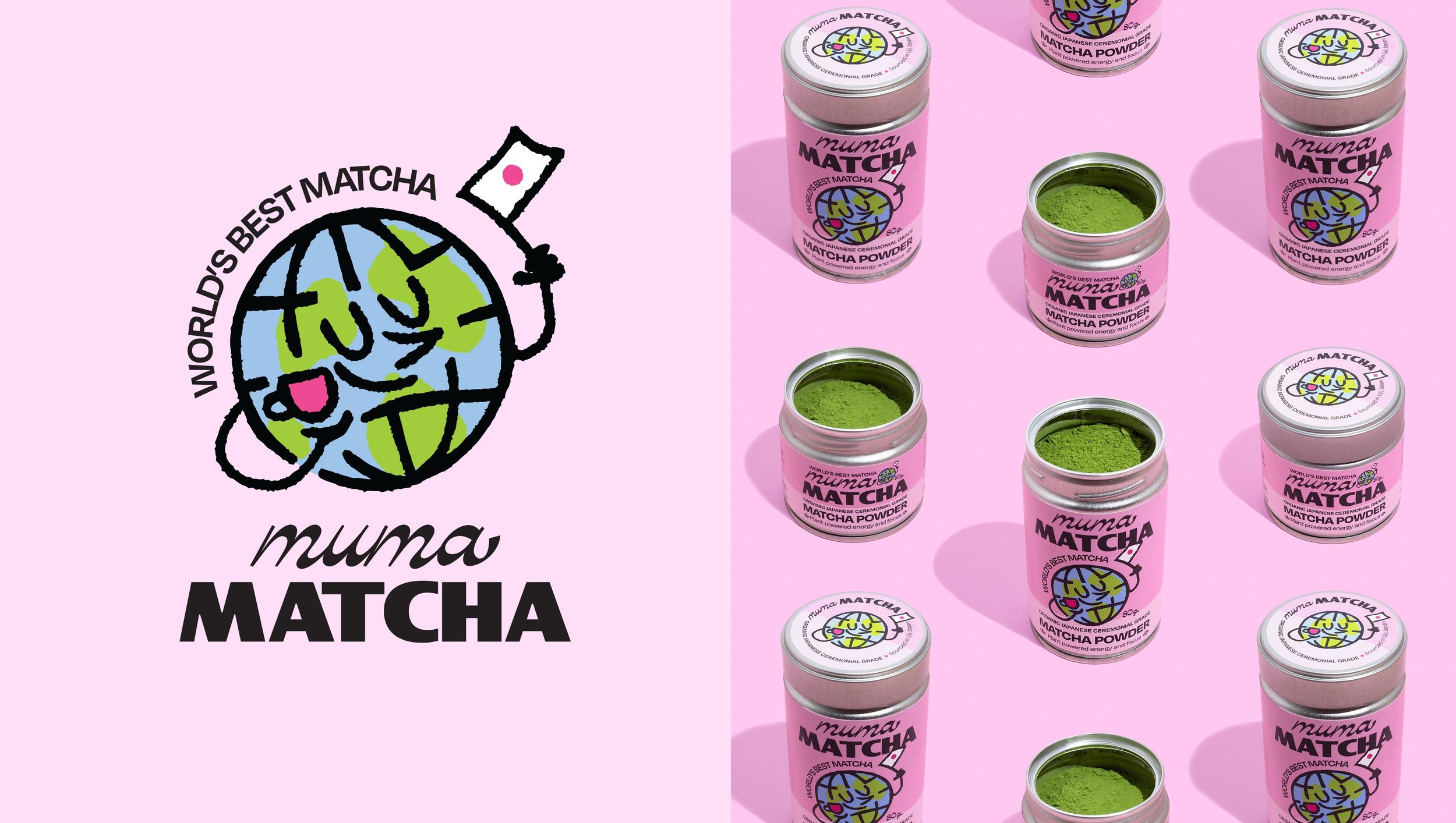
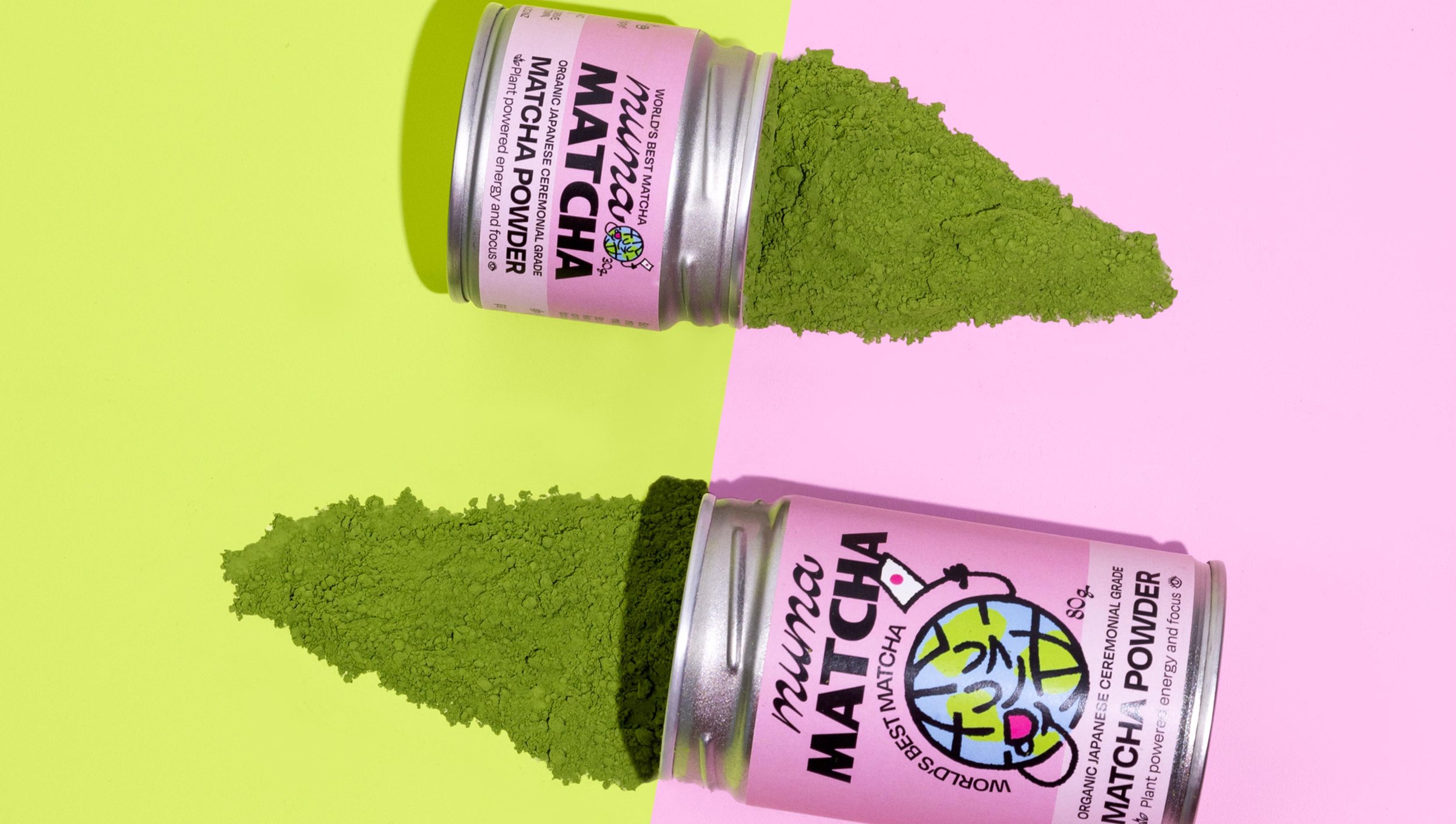
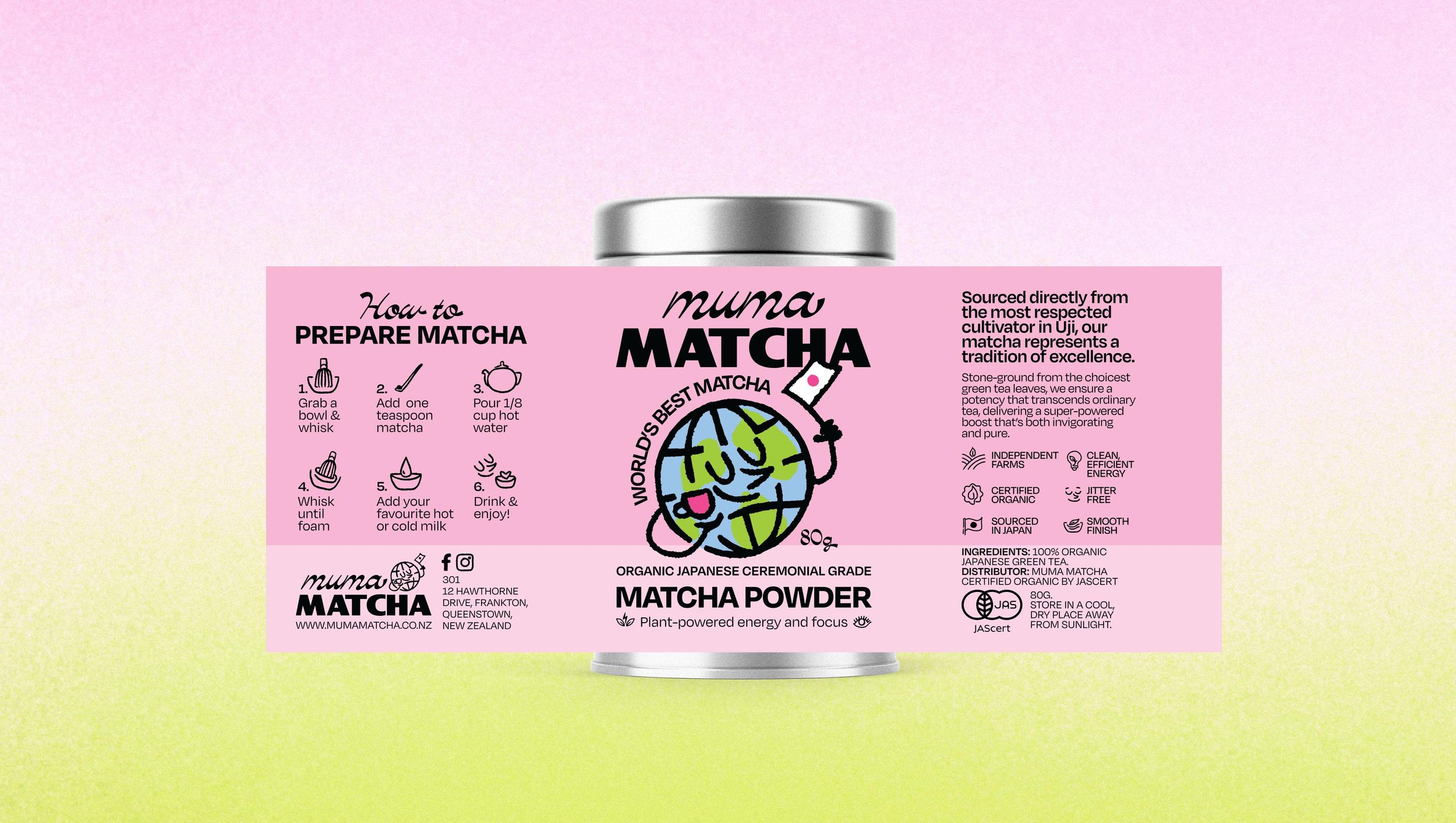
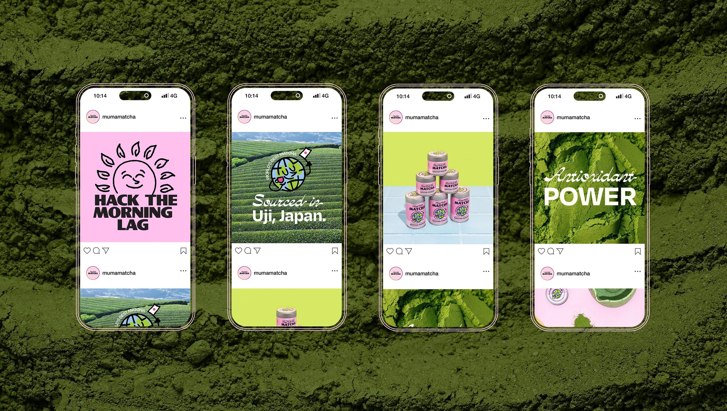
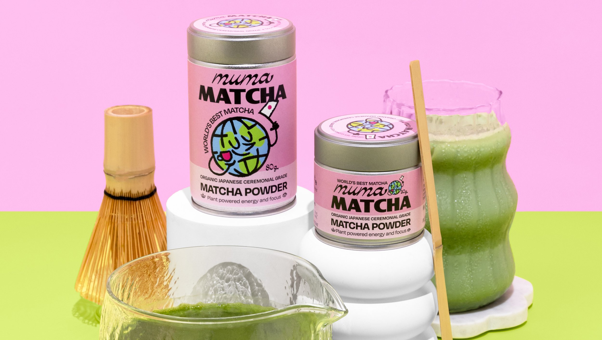
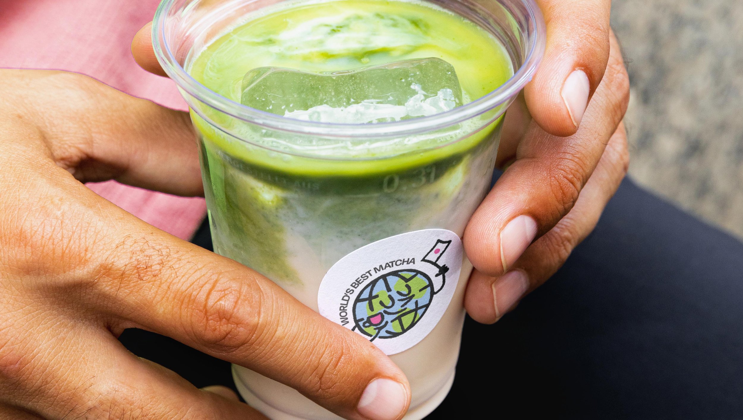
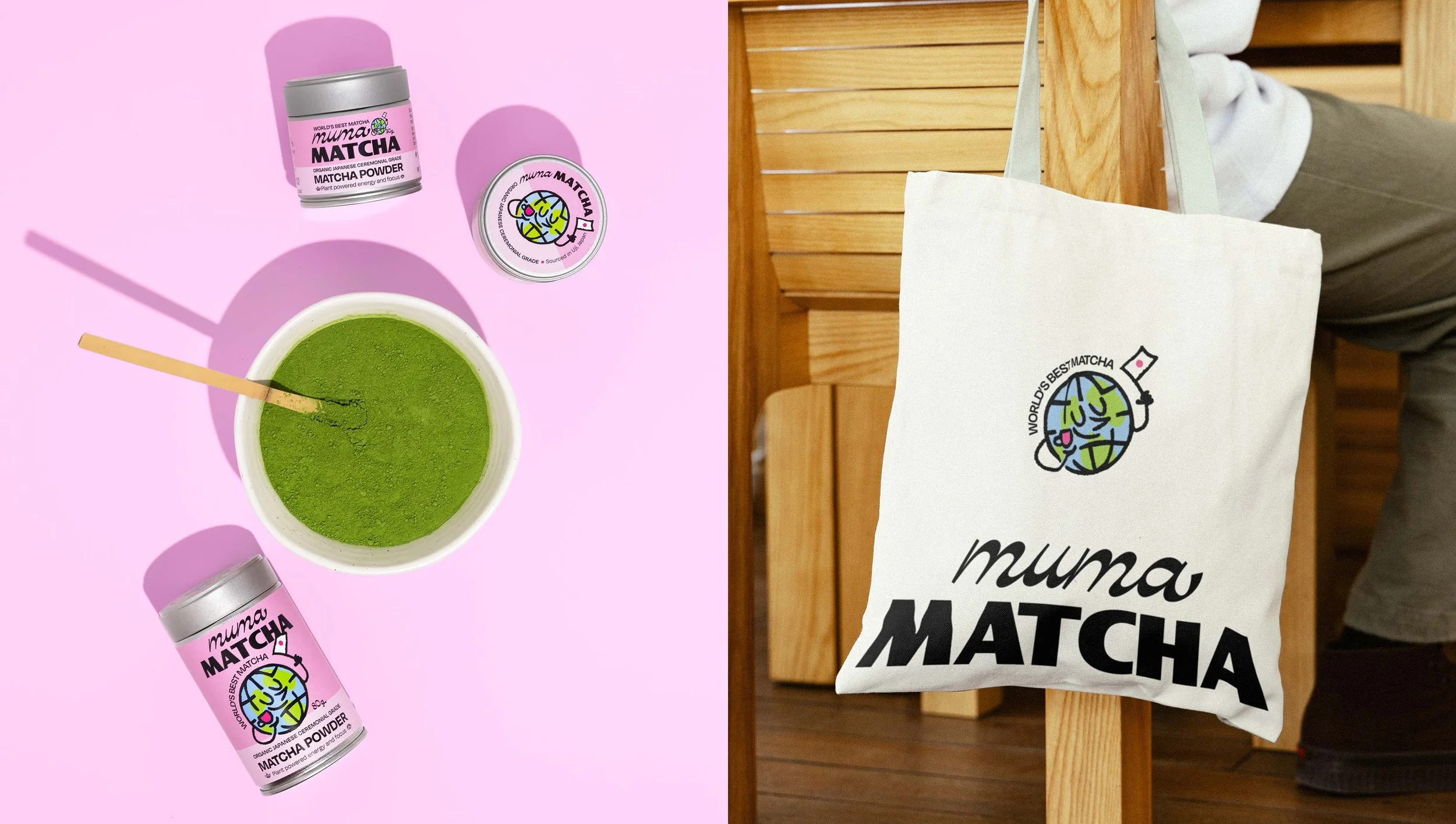
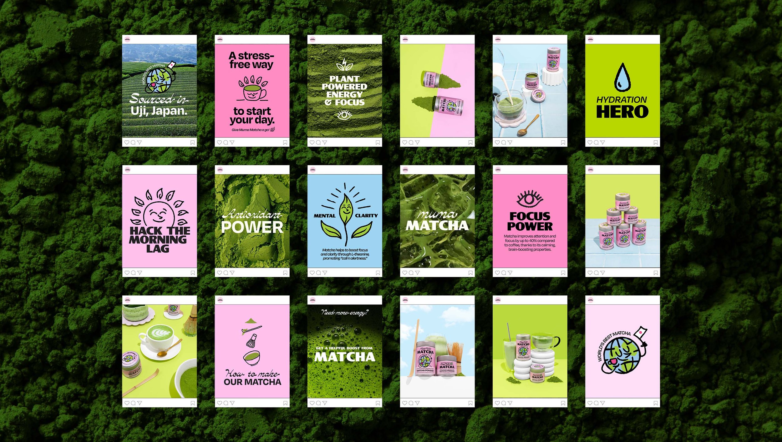
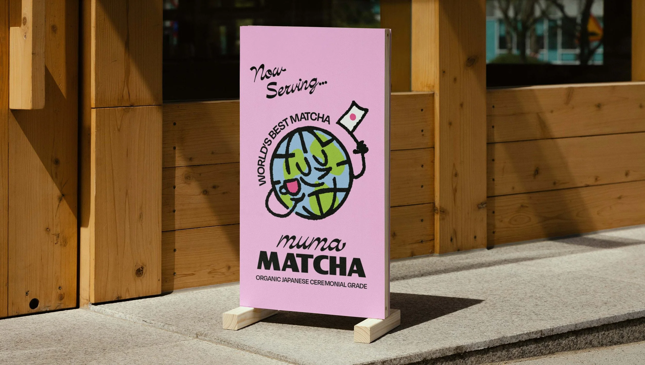
Muma Matcha required a full rebrand – identity, packaging and website to relaunch their product in 2025. They required a brand identity that had a fun, playful feel and amplified what makes them different from other brands; their matcha is some of the best in the world. Sourced from Uji, widely known as the birthplace of high-quality ceremonial grade matcha, it really is, as their tagline states; ‘the world’s best matcha’. To play on this concept, a mascot character was created; a globe drinking a cup of Muma Matcha.
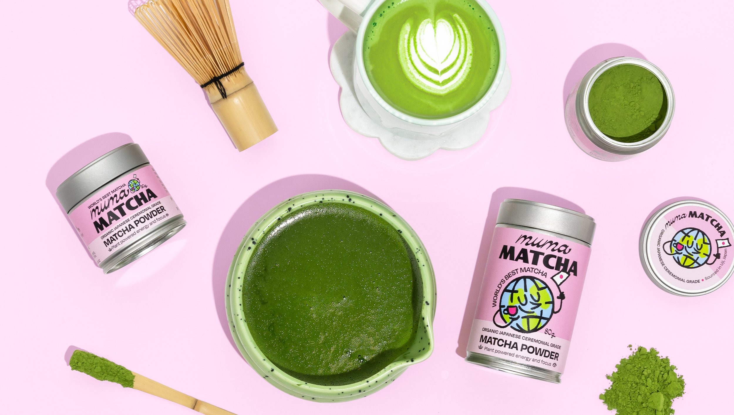
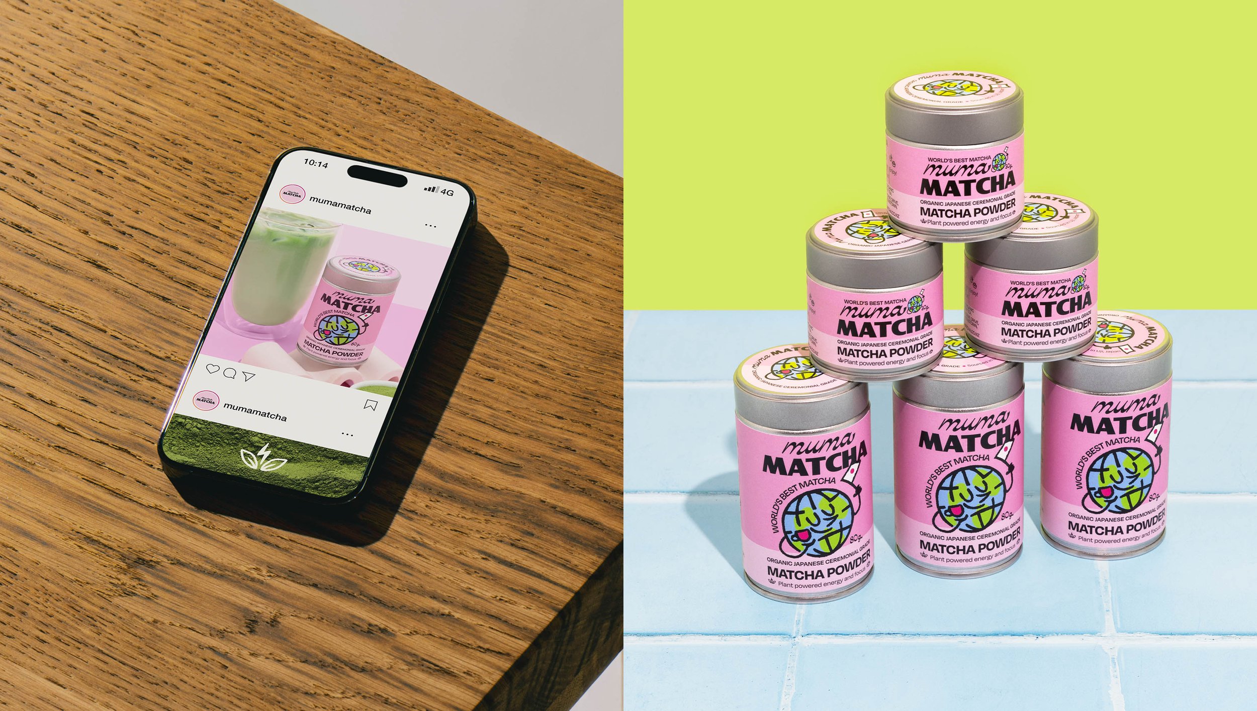
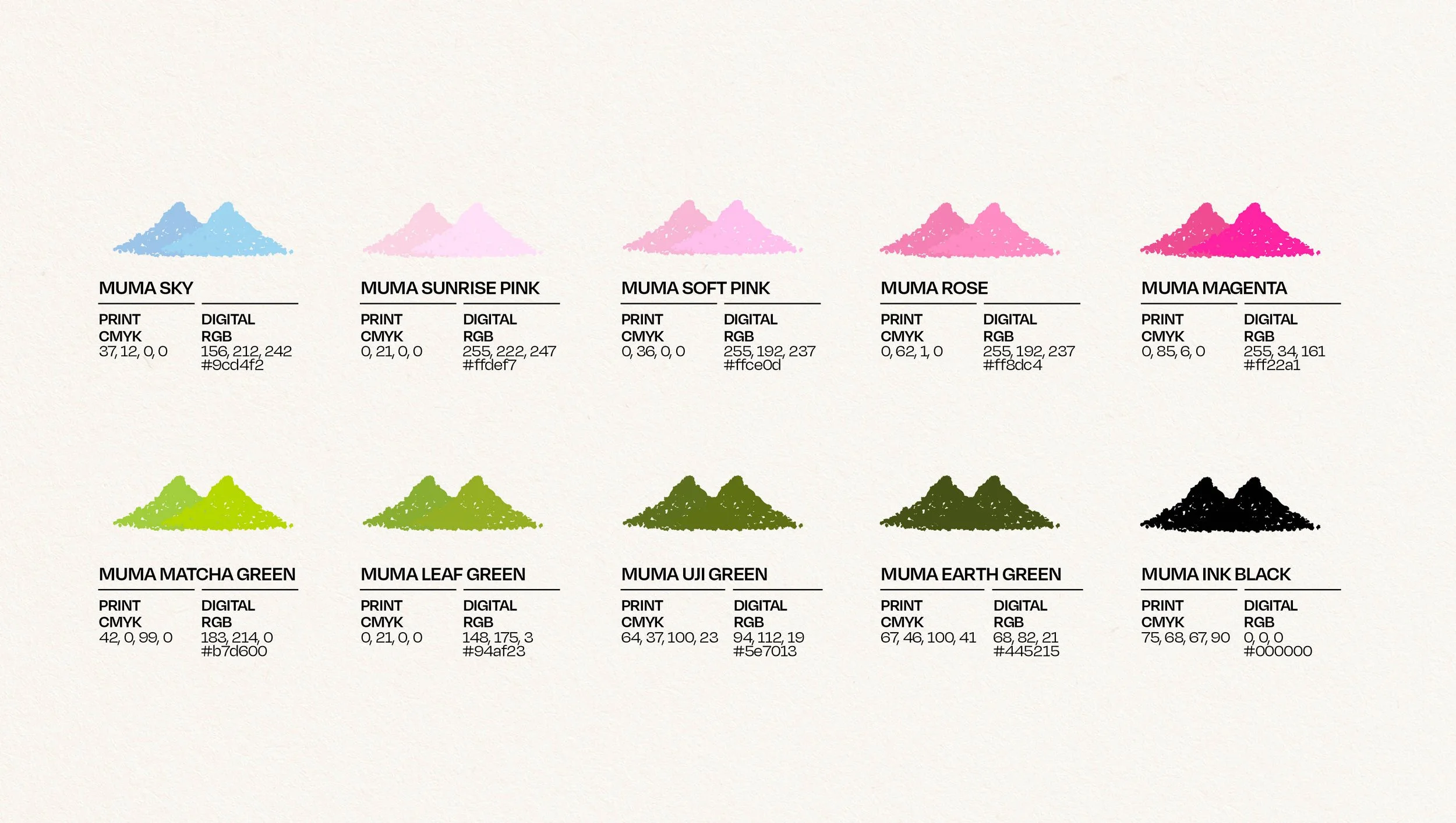
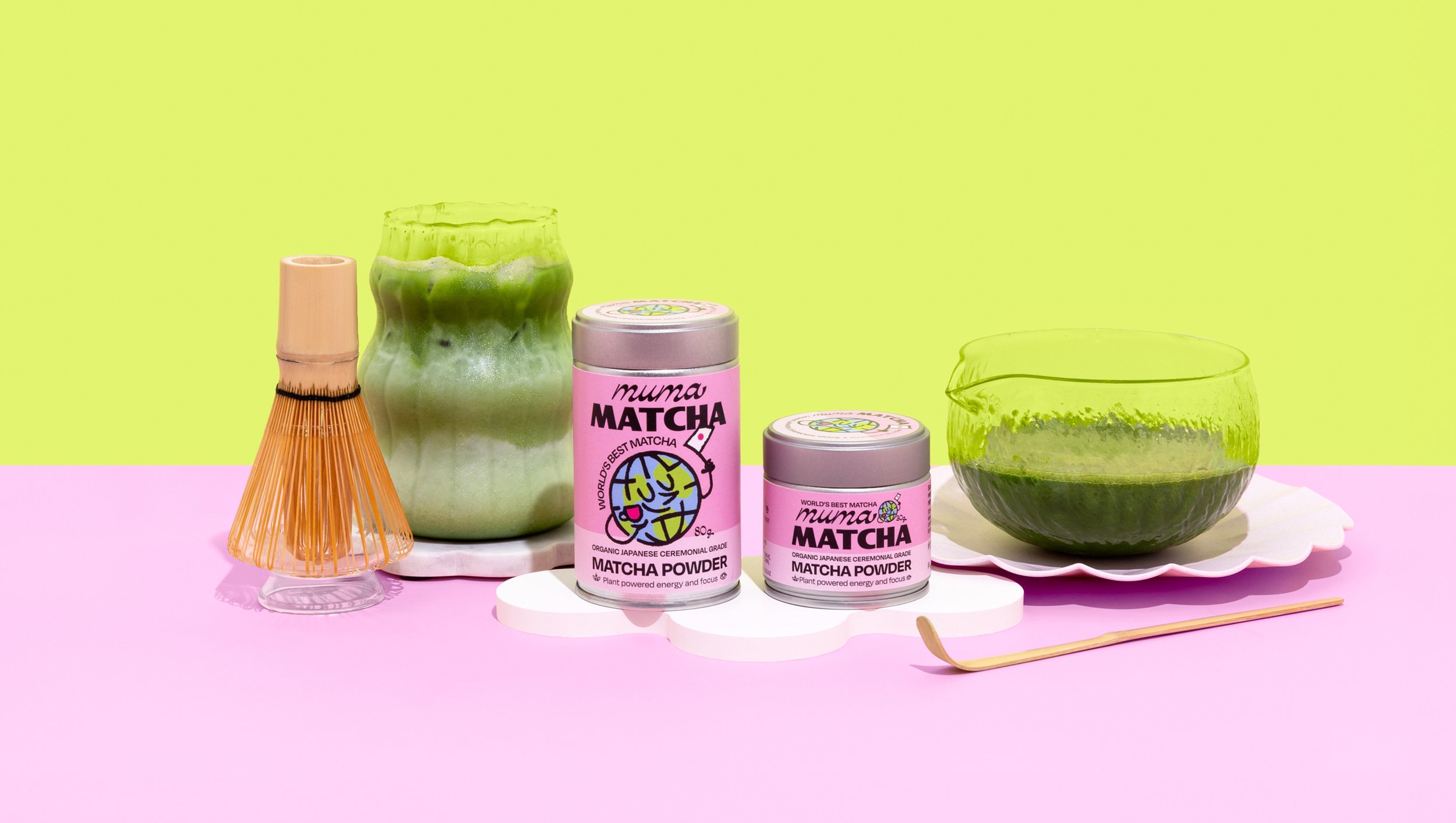
Their brand colours of pink and green were carried through the rebrand, giving a vibrant uplift across the their 80g and 30g tin packaging. Their website was given a full redesign, with fonts, imagery and layouts to match their new identity.
The result? A brand and packaging design that’s a blast of colour, making ceremonial-grade matcha feel anything but stuffy. The tins are wrapped in bubblegum pink, with playful, hand-drawn typography that gives it a lively edge. Against the bright green of the matcha, the contrast is sharp and eye-catching. The design is casual and fun, positioning Muma as an approachable option for daily matcha drinkers.
Muma Matcha offers delivery NZ-wide and is available at many Queenstown eateries, including Odd Saint and The Coffee Club. -
Featured on the Dieline:
Muma Matcha Serves Up Playful Pink Packaging -
Photography Credits:
LS Creative Studio